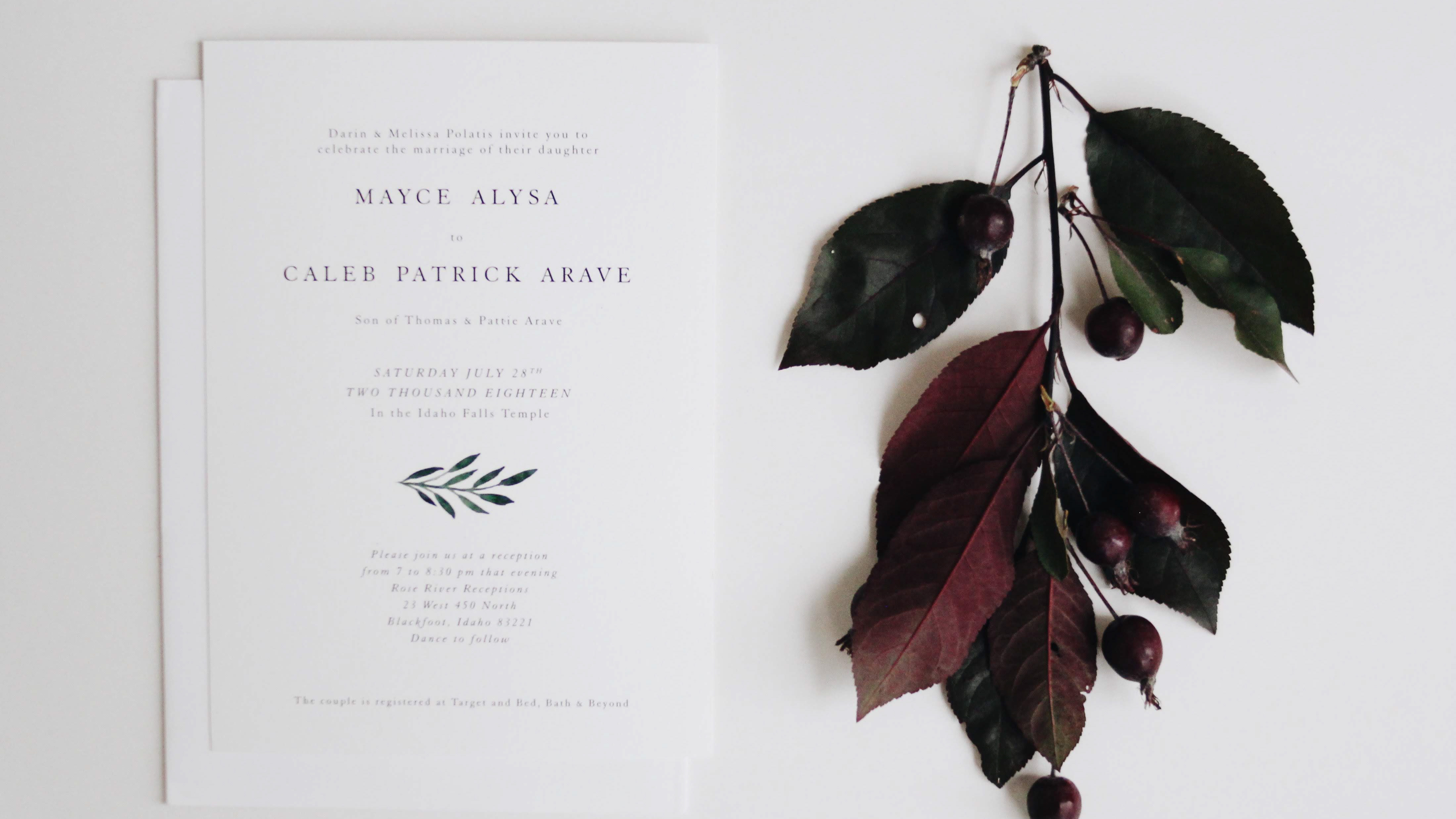
I love letterpress. I love the whole experience. Designing for letterpress is a slightly different process for me. I think of the final product, the texture, the paper, mixing the inks, and this all goes into the design. The process has become a familiar one to me, and the presses like a friend (or at 3 in the morning an enemy). This has allowed me to have a more personal experience with the printing process. Some of my favorite and most personal work has developed through letterpress. I think this is a result of not only the mental labor and creativity, but the physical labor that goes into manually printing each item. Physically making plates, cutting each paper to size, feeding them through the press, mixing the inks to get the perfect hue. The customization that is possible, and the familiarity with each project is something that I have only learned through the art of letterpress.
Business Card
I designed this business card ultimately to be letterpressed. Every element of it had to be carefully considered; kearning, the line weight, spacing and the paper. I wanted something simple that would be elevated by the experience of feeling the card. I wanted to make it aestheically pleasing, but it really is meant to be physically held, as all business cards are.
Good Timber
The poem by Douglas Malloch inspired this print. His words ring so true to me, and inspired me to create my own tree rings. That's right, I created each ring, each imperfection, and it became a very personal creation for me.
Travel Brochure
The following was a project for school in which we were assigned to create a travel brochure for an imagined destination. Not only did I create the brochure, but also the island it is depicting. It was inspired by my grandpa, a man who had many hobbies and interests. He has inspired me everyday to create and build with my own hands. One of my greatest design inspirations, he designed and created his own world, that as children we would escape to. The overall design is inspired by his clean midcentury style, and his classic nature.
Idaho Falls Temple
This project was a personal one for me. This place is very near to my heart, and I have been searching for an image of it to display in my home. I just couldn't find one that displays it's beauty but remains true to my style, and the simple but elegant nature of the Idaho Falls Temple. I decided to create my own. I chose to print it on two different types of paper (the first is Lettra and the second is Inges).
